How to Use Pantone's 2022 Colour of the Year to Renovate Your Home

Despite all the chaos and uncertainty of the Covid pandemic and lockdown, 2021 was a year of hopefulness, positivity, and immense creativity. Homeowners started putting extra effort into turning their homes into the kingdom of solitude. Hence, Pantone's Colour of 2022, Very Peri - a unifying mix of red and blue heavily inspired by the glimmer of hope 2021 has brought into our lives with endless technological and economic growth and innovation.
With a violet-red undertone, this colour scheme unfurls a dynamic presence in an interior space with a sense of gratification and a sprightly atmosphere.
About Pantone's Colour of The Year
So what are Pantone and its colour of the year? The history of Pantone goes way back to 1963 when it developed its first colour matching system combining pan and tone. The colour matching system, Pantone Matching System (PMS), has been helping graphic design, printing, and manufacturing industries match colour accuracy and identification ever since.
In 2000, The Pantone Colour institute started the trendsetting concept of producing a new colour scheme as the year's Pantone colour. Right now, Pantone Colour of The Year has become one of the most influential global phenomena, especially for the world of social networks, fashion and lifestyle. Each of these coloured is inspired by not only the fashion or entertainment industry but also the global socio-economic conditions and technological transformation.
Now let's get back to Pantone's colour of 2022, Very Peri. We mentioned earlier, the continuation of the Covid-19 pandemic inspires warm and vivid lavender. In addition, technological advancement and the rise of Metaverse are the key highlights of 2021 and beyond. So Very Peri is not simply just about a brand new shade of lavender, but also its powerful underlying message.
As a homeowner and home decor enthusiast, you may or may not follow up with Pantone's colours. But that doesn't stop you from starting fresh with Pantone's colour of 2022, Very Peri- a colour that unfurls passion and zeal. So let's check out some periwinkle inspired home decor for 2022 to stay à la mode!
Pair up with the most Elevating Colours
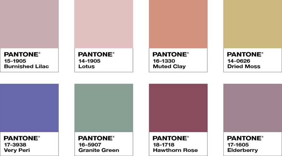
But the best part of PANTONE 17-3938 is how versatile this colour is and how well it blends in with any decor theme and pairs up with other colour schemes. So let's check out some of the colours, perfectly suited with Very Peri for any wall decor.
● Cream and Light Grey: If you want to keep your room bright and airy, white or soft cream with a bit of an edge of very peri can be a perfect pair for you with striking contrast.
● Dusty Rose and Lavender Grey: Dusty rose is another beautiful colour scheme that goes against the mix of red-violet tones like no other. If you want to accentuate your interior walls, Dusty rose, lavender Grey and Very Peri and its periwinkle blue hues can be an ideal blend of colours for your walls.
● Black: Black embodies elegance and sophistication that can invigorate any room. With Very Peri, you can immediately create a moody vibe.
● Sea Grass: If you want a soothing and tranquil aura in your house, seagrass can be a great option to go with Very Peri, which encompasses all the features of lively and moody blue.
The best practice while choosing the right colour combination from the colour wheel is to direct assistance from Dulux accredited residential painters. As house orientation, size etc., play essential roles in the best-suited colour schemes, make sure you have professional consultation throughout the process.
Adorn Your Space with Very Peri Rugs, Drapes and Shutters
Very Peri is the eighth blue shade Pantone has selected over the last 21 years. Blue undertones keep coming up on the top because of their versatility and timelessness. And a sense of homeliness and nostalgia. However, Very Peri has a modern edge with blue and red undertones that showcase "daring curiosity" or "carefree confidence".
So if you want to keep your walls' neutral tones but still want to give your decor a stroke of this iconic violet-red colour in 2022, make its way to the rugs, cushion covers or drapes, giving your decor fabrics a velvety, luxurious look. If you're not a big fan of solid colours, use very peri colours in geometric, chevron or floral patterns in your throw pillows, faux cowhide rugs, shutters and cushions against the neutral or mute backdrop. These bold hints of periwinkle will effortlessly highlight all the cozy corners of your house with a striking visual effect.
Create a Bold Statement Wall
Periwinkle can make a gorgeous, eclectic splash of shade in any room with a vivid hue and statement-making accent. This is especially true if you want to create an accent wall against neutral-earthly, nature-inspired wall colours. Furthermore, very Peri goes against almost any soft and sombre colours without overpowering them or overshadowing the calming effect.
Instead, with the help of professional painting service, this colour can give you an exciting opportunity to experiment with 2022's most iconic, contrasting hue creating a "timeless effect with a modern twist" and forming dynamic combinations. You can also add a mix of modern artwork, framed mirrors, photographs, lamps and wall hanging interior plants to create a cheery-exuberant appeal.
Spice Up the Shutters and Front Door
Front doors, windows, and shutters are important architectural elements that we often ignore. How often do we think of giving our main entry door a brand new look or windows a fresh splash of colours? Well, 2022 could be the year of innovative and free-spirited home decor for you, just like Pantone's colour of the year suggests.
If your house has a white or very neutral colour scheme all the way, consider painting your front door and window trims and shutters Very Peri with an orange-yellow or red-plum undertone and added texture. The vivid violet-blue of periwinkle can create a complementary contrast against natural sunlight, enhancing your home's curb appeal like never before.
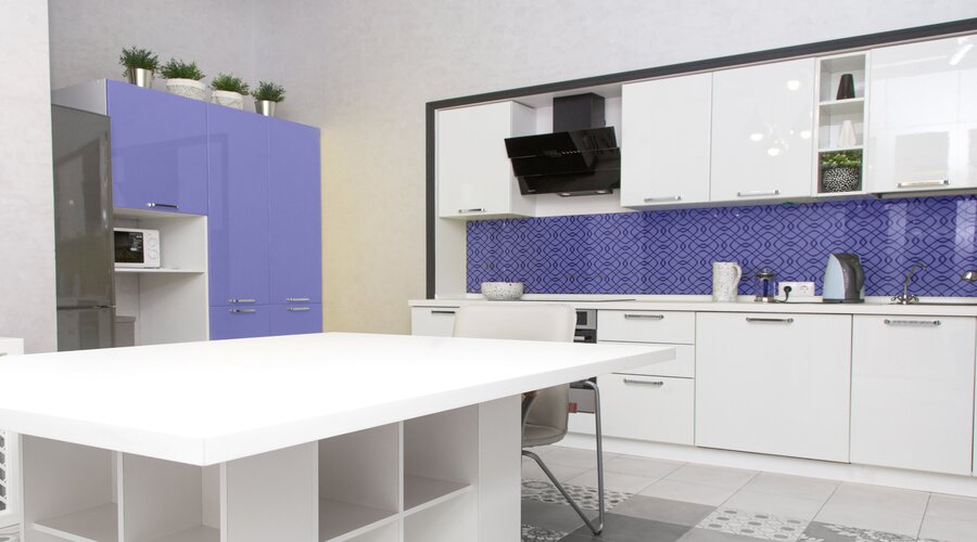
Add Very Peri Furniture against Neutrals
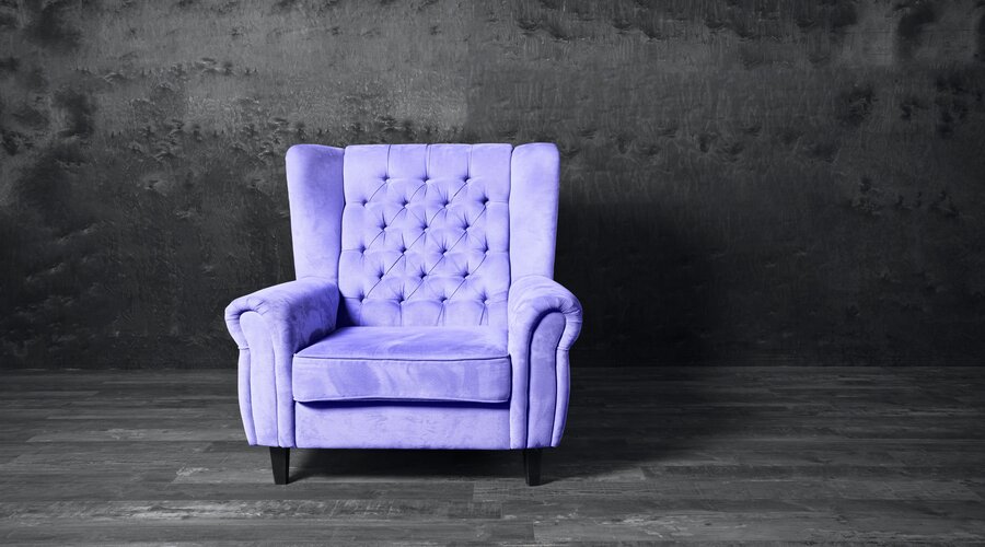
Every room needs a gorgeous piece of statement furniture that stands out from the rest. Or else the whole room feels a little dull and muted that doesn't compliment your creative personality. So while giant artwork or decoration pieces are still very much on-trend, you can incorporate this highly influential periwinkle shade of blue in your furniture this new year.
It could be a set of ottoman, classic lawson or modern wingback chair. Don't worry about how different or "out of theme" your furniture piece is from the rest. We are in a time where the more contrast, the better. Just make sure your furniture doesn't make the room too busy or cluttered, and you are good to go with a touch of Pantone's bold and bright periwinkle in your furniture.
To Sum Up
As soon as Pantone announces its annual choice of colour every year, designers, artists, and marketers draw all their attention towards it to understand the trend direction of colour, art, and fashion.