Pantone Colour of The Year Since 2000

Every year, Pantone announces its Colour of the Year, but do you really know what it is?
Despite being established in 1962, Pantone LLC didn't get widespread recognition until 2000, when it introduced its renowned superlative, "Pantone Colour of the Year." Since its introduction, “Colour of the Year” has tremendously affected visual culture across industries and around the world. It appears that almost every business pays attention to the colour forecast from the most powerful colour system in the world, from consumers of fashion and cosmetics to product and interior designers and manufacturers.
The Pantone Colour of the Year now represents much more than just "what's trending" in the design industry. Rather, it is a true reflection of what is required in the modern world. According to Pantone, these shade predictions have also been impacted by new materials, textures, technologies, social media platforms, and even forthcoming international sporting events.
With changing priorities and global emotion, the theme and inspiration of the colour in each decade also shifted. This guide here is here to help you understand the revolution of the selected colours of each year by Pantone, starting from the 2000s till the latest year of 2026 and a few predictions for 2027, so that you can prepare for future colour trends.
Does Colour Reflect Emotion?
We are more impacted by colour than we realise. It affects how we react to a brand, how we feel in a room, and even how secure or energised we feel. People naturally lean toward hues that suit their emotional demands long before trends catch hold. Pantone does not select its Colour of the Year in an empty space. Factors that influence the choice can be
- Social behaviour
- Financial constraints
- Cultural discussions
- Lifestyle modifications
- Technological advancements
In many respects, the shade that is selected represents what people are emotionally yearning for. It can be calm, self-assurance, warmth, or escape, for example.
That’s why we are looking at Pantone colours over time with more insight than simply viewing them year by year.
2000–2004: Peace, Hope, and a New Beginning
The year 2000 started off in a serene tone and carried on this theme with optimism and hope. Colours during this period felt expressive and confident without being overwhelming. There was a sense of experimentation, as people embraced change and new ideas with enthusiasm rather than fear.
These colours reflected peacefulness, yet a world stepping forward, curious about what the future might bring.
2000 – Cerulean Blue
Cerulean Blue, the hue of the sky on a calm, clear day, was Pantone's first Colour of the Year and the official colour of the millennium. It suggests times of calm, tranquillity, and relaxation.
2001 – Fuchsia Rose
A bright, feel-good, feminine colour, Fuchsia Rose was the next trendsetter for the year 2001. It is an intense, passionate shade, yet also warm and exciting.
2002 – True Red
It appears that the tint Fuchsia Rose from 2001 was simply too difficult to let go of. The sophisticated, mature version of it, True Red, is often linked to power, love, and passion. The red served as a reminder that a basic primary colour might still be an attractive option.
2003 – Aqua Sky
Aqua Sky restored the tranquillity that 2000 had promised with an unexpected switch from the reds and pinks that had dominated the previous few years. The blue-green Aqua Sky adds a serene appearance. It is connected with soft, cold, and peaceful.
2004 – Tigerlily
Tigerlily made it very evident that orange was the new everything by being bold, fierce, and slightly unique. The flowers all around us serve as the inspiration for this vibrant and rejuvenating shade.
2005–2009: Energy and Emotional Expression
Pantone made more bold and lively options as the decade went on. Warm tones, vivid pinks, and bright blues first appeared when individuals were trying to express and let go of their emotions. Global unpredictability, economic stress, and swift technology advancement created this era. These hues tended toward exposure and confidence rather than subtlety. They were intended to be felt emotionally and used boldly.
2005 – Blue Turquoise
The soothing and comforting Blue Turquoise, which draws inspiration from the colour of the water, has a softer tone than true Turquoise. It referred to emotional balance and escape in the rapidly evolving digital era.
2006 – Sand Dollar
Sand Dollar, Pantone's first non-vibrant tint, achieved first place as a useful neutral. The shade is regarded as a natural and intuitive way to express worries about the 2006 economy. It gained popularity as an interior and exterior paint option.
2007 – Chili Pepper
This Red hue's boldness is attractively eye-catching, elegant, and alluring. It is a deep, fiery red. Chili Pepper suggests a cheerful, confident, and design-savvy mindset.
2008 – Blue Iris
The previous calming blue shades got a new vibrant identity this year. Blue Iris fulfils the need for comfort in a complicated environment by fusing the mystical and spiritual features of purple with the steady and soothing aspects of blue.
2009 – Mimosa
A bright and optimistic shade, Mimosa felt like a dose of positivity in 2009. Optimism is crucial during a period of political and economic unpredictability, and this yellow shade is the colour that best conveys hope and assurance.
2010–2014: Close to Nature, and Reassurance
The early 2010s saw a change toward balance and grounding following years of intensity. Pantone started focusing on natural and comforting shades of green and blue. These hues represented a return to simpler ideals, wellbeing, and sustainability.
2010 – Turquoise
Like 2005, "Turquoise" is a warm, radiant colour that blends the calming characteristics of blue with the energising elements of green. Inspired by elements of nature such as water and sky, it is a colour of faith and truth.
2011 – Honeysuckle
The reddish-pink "Honeysuckle" shade was chosen because it is uplifting and encouraging, and it is said to be a hue for all seasons. The revitalising hue was selected to provide boldness, spirit, and self-assurance.
2012 – Tangerine Tango
Tangerine Tango is a captivating colour that is reminiscent of the bright shades of another natural attraction, such as sunsets. It was chosen to give a surge of energy and a refuel to proceed.
2013 – Emerald
Emerald is a brilliant, gorgeous colour that represents beauty and new life. The elegant hue "Emerald," which is most frequently connected to beautiful, priceless gemstones, but Pantone notes that it also symbolises growth and a sense of nature.
2014 – Radiant Orchid
Radiant Orchid, a captivating combination of fuchsia, purple, and pink undertones, exudes great joy, love, and health while inspiring confidence. This shade is also inspired by the most beautiful natural element, which is the flower.
2015–2019: Identity and Connection
Tints from the mid to late 2010s felt more personal. Pastels and softer tones began to appear alongside vivid hues. Pantone selected choices that highlighted self-expression, inclusivity, and connection throughout this time. Colours were no longer so much about making a statement as they were about creating environments that felt welcoming and human.
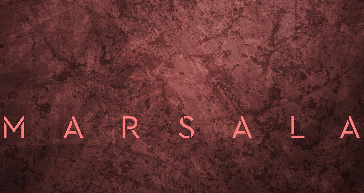
2015 – Marsala
Marsala is a naturally strong and earthy red wine that benefits our bodies, minds, and spirits. Pantone describes this tone as "enriching bodies, minds, and souls" The colour was chosen because it is universally appealing and has the ability to translate to home design, fashion, and beauty.
2016 – Rose Quartz & Serenity
The combination of two hues, Rose Quartz and Serenity, was selected as the Pantone Colour of the Year for the first time. Rose Quartz is a soft, seductive tone that exudes calmness and compassion. Like the vastness of the blue sky above us, serenity is light and airy.
2017 – Greenery
Greenery is a revitalising and refreshing shade that represents fresh starts and a connection to nature. The initial days of spring, when "nature's greens revive, and renew," are evoked by the vibrant yellow-green hue Pantone added.
2018 – Ultra Violet
Ultra Violet is a dramatically provocative hue of purple that conveys creativity, inventiveness, and innovative ideas.
2019 – Living Coral
Living Coral is a vibrant, life-affirming coral colour with a golden undertone that enlivens and energises with a gentler edge. As Pantone says, "Our innate need for optimism and joyful pursuits" is represented by the shade.
2020–2022: Calm, Digital Reality, and Emotional Reset
Stability became a top priority as soon as the world entered the 2020s. Pantone concentrated on the fusion of the real and virtual worlds, technological innovation, and flexibility in the face of swift change as life got more and more digital. When routines and expectations were being revised, the colours provided emotional stability.
2020 – Classic Blue
Classic Blue was selected because it was "solid and dependable" heading into the new decade and provided a comforting presence that encouraged connection, calmness, and confidence.
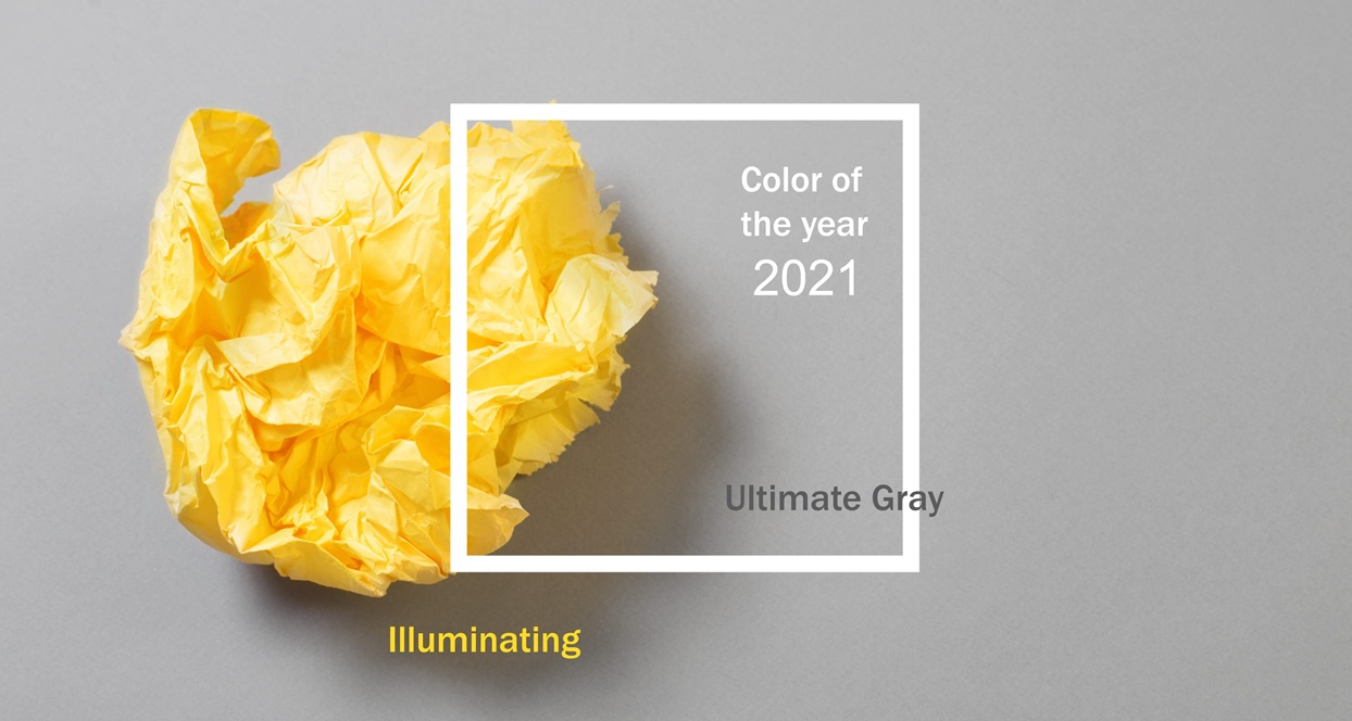
2021 – Ultimate Grey & Illuminating
For the second time, the combination of two shades, Illuminating and Ultimate Grey, has been selected as the Pantone Colour of the Year. Bright and cheerful, Illuminating is a shade of yellow that is infused with solar energy and sparkles with vitality. Quietly reassuring, Ultimate Grey promotes feelings of calm, stability, and fortitude.
2022 – Very Peri
With a vibrant violet-red undertone, Very Peri is a bright periwinkle shade of blue. Very Peri combines the dependability and consistency of blue with a futuristic vibe that inspires innovation and inventiveness.
2023–2024: Confidence and Warmth
As people began rebuilding routines and relationships, Pantone’s colours shifted again. The focus moved toward confidence, bringing warmth back into everyday spaces. The colours shifted the mood from shades of blues in previous years, and added the vibrancy back to the palette again.
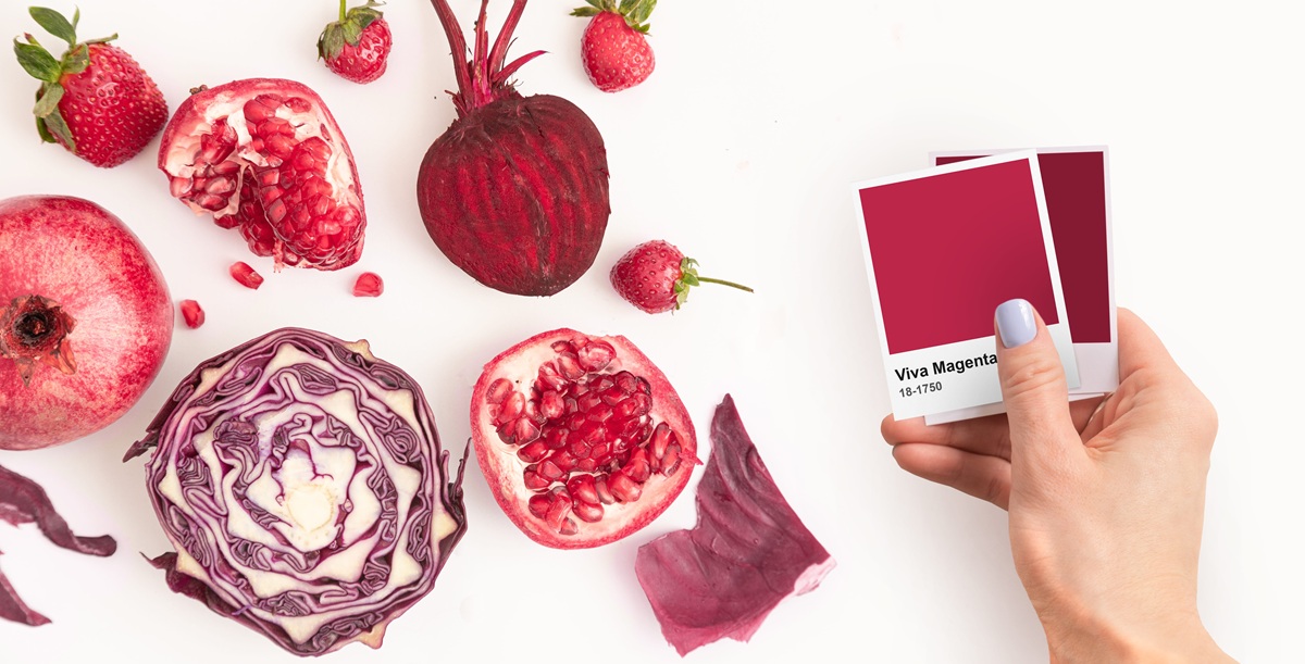
2023 – Viva Magenta
Warm and cold are balanced in Viva Magenta, a subtle crimson red with pink undertones. This hybrid hue, which has its roots in nature, is strong, empowering, and authoritative without being aggressive.
2024 – Peach Fuzz
The Pantone Colour of the Year forecast celebrates its 25th anniversary with this unique shade called Peach Fuzz. Nestled between pink and orange, it is a soft peach hue with a sentimental vibe. This warm and inviting colour evokes a fresh modernity while expressing love and care.
2025–2026: Neutrality and Emotional Breathing Space
In the present era, neutral tones and soft colours are more preferred. These hues seem deliberate in a world that has witnessed years of speed, noise, and nonstop stimulation. It's a sign of relaxation, emotional spaciousness, and ease.
Here, neutral doesn't mean boring. It means balance.
2025 – Mocha Mousse
Mocha Mousse is a chic shade of warm, rich brown. It shifts people's impressions of brown from being modest and grounded to more luxurious and aspirational. Its name appeals to the need for comfort by referencing the delicious qualities of coffee, chocolate, and cacao.
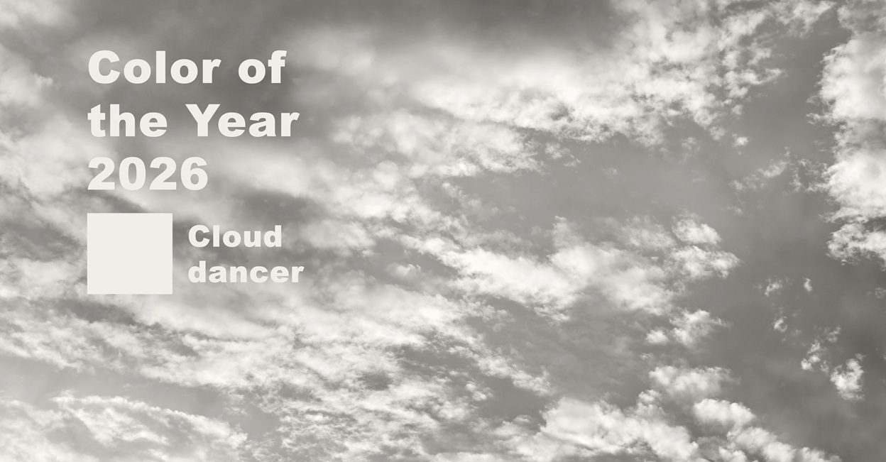
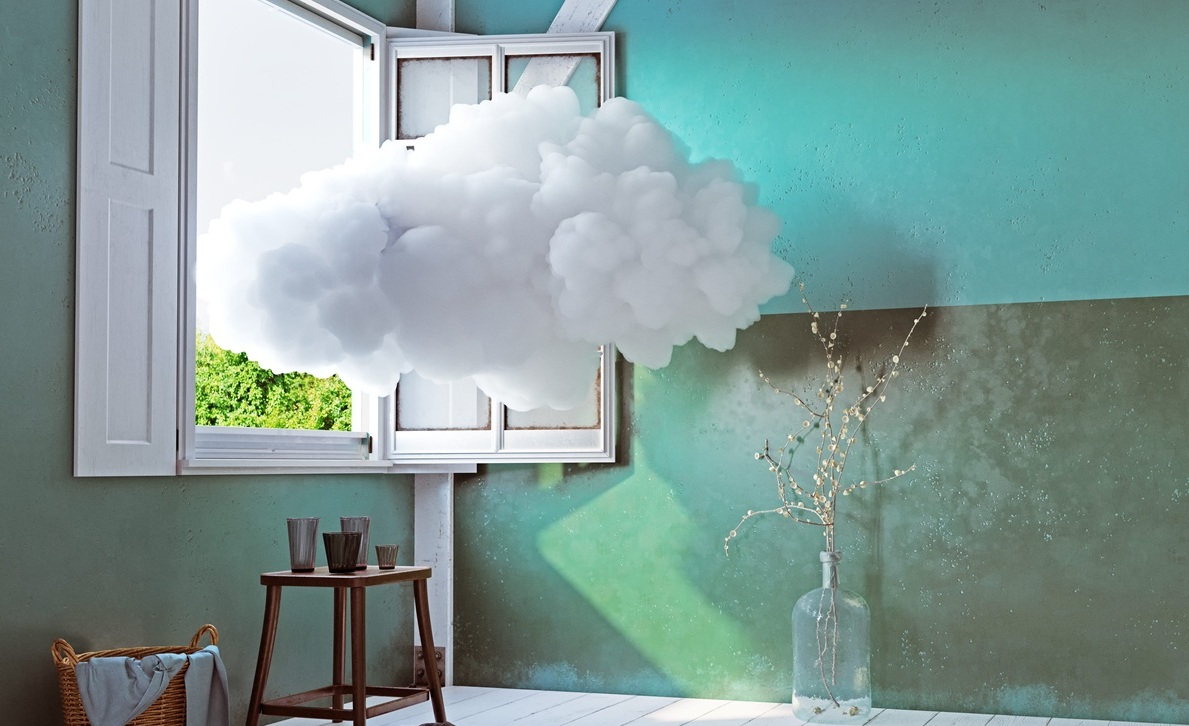
2026 – Cloud Dancer
Described as a "billowy, balanced white imbued with a feeling of serenity," Cloud Dancer is an ethereal colour that serves as a whisper of peace in an overpowering world. Cloud Dancer calms the mind, promoting genuine peace and concentration that permits the mind to wander.
What the Pantone Colour Timeline Tells Us About the Future?
When considering the entire history, Pantone colours are moving away from dramatic statements and toward emotional support. As individuals look for balance in their daily lives, future hues are probably going to emphasise serenity, adaptability, and comfort.
Leading trend forecaster WGSN and Coloro predict the shade Luminous Blue to be the 2027 Colour of the Year. However, as the present two shades of this era are more on the soft shades, if you are focusing on long-term commitment to any colour, like painting your house or office space, it's best to choose from this latest neutral palette. In this way, even if the next colour comes from the vibrant group, you can include that through small elements in a neutrally painted room.
Conclusion
The emotional changes that have taken place in the world since 2000 are represented visually in Pantone's Colour of the Year selections. Each shade represents a certain moment in time that is shaped by emotion, culture, and common experiences.
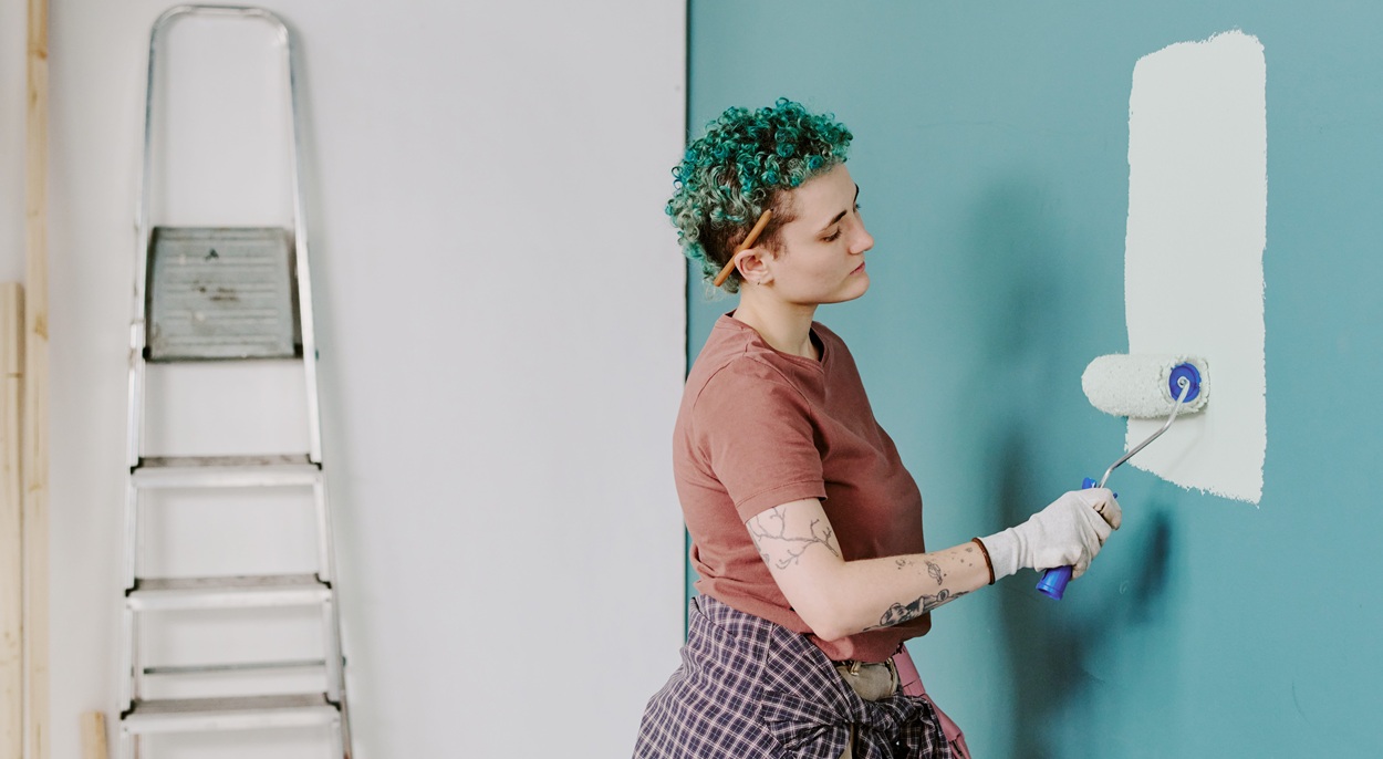
If you want your residence or commercial space to be flawlessly painted in the Pantone Colour of the Year 2026 or any year, contact Premier Painting Company and hire Dulux accredited painters for the best results.


.png)
.png)