5 Home Colour Options to Keep an Eye on in 2018
Colour hues and decorative trends tend to change quite quickly, whether we’re talking about the commercial or residential space. It is the job of painting service providers and colour consultants alike to have their ear to the ground in terms of what is in vogue.
If you’re in search of inspiration, you’ve come to the right place. We’ve put together a list of five of the most popular decorative trends as 2017 winds down.
Carnival Red
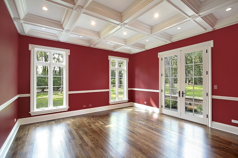
Deep red and crimsons are already quite popular, both as an interior and exterior colour. Often used to contrast with other, more conventional paint colours such as light or deep blues and whites, Carnival Red can draw the eye to certain points around the house. It is particularly effective as a front door colour, but works well indoors when splashed around the living or dining room. Try combining with light grey to draw it out even more.
Black
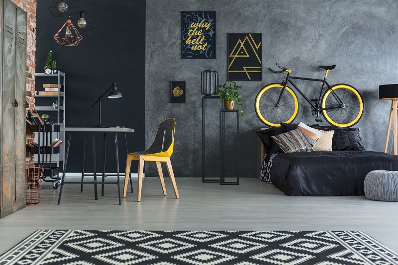
It might seem rudimentary, but we couldn’t talk about what’s going to be hot in 2018 without discussing black. Often used to make a statement, all-black rooms are becoming all the rage, creating a dramatic yet alluring look. It also makes for a great foundation to experiment with vibrant yellows and grey-greens. Certainly an option for a study or office.
Brass
The weathered brass look is coming back into vogue, and can be utilised as a decorative colour in the main rooms of your home. Obviously, the colours you choose to use with it can define whether it looks the part or comes off looking out of place and awkward. In this case, you generally want to be going for greys and off whites. Having a few brass coloured decorative features in the room can really add depth and intrigue to an otherwise plain looking setting.
Earl Grey
We’ve already mentioned how effective grey can be as a base colour when paired with more lively, daring hues. This makes it particularly versatile, as it can be dressed up in multiple ways and suits almost anything you’re trying to do stylistically. It’s worth noting just how warm and cozy an Earl Grey colour can be in the bedroom. Try combining it with a mahogany brown to bring this out even more.
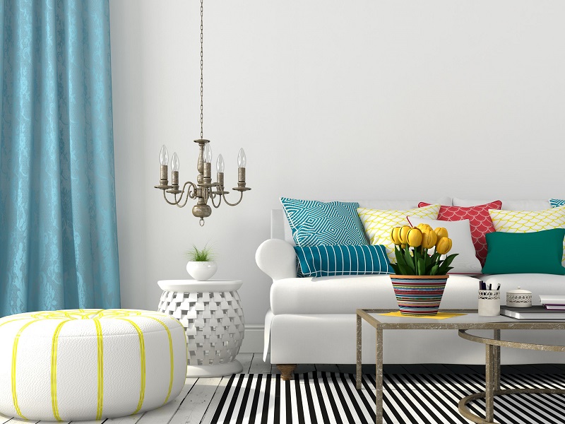
Paradise Blue
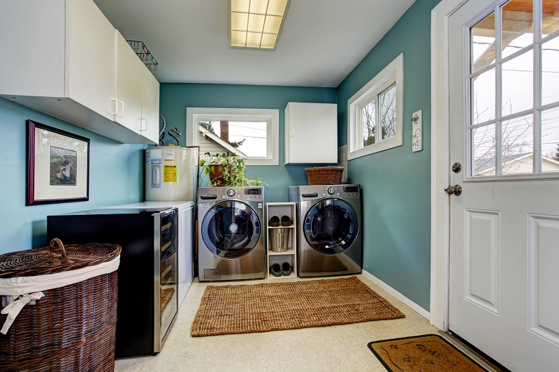
You can create a relaxed, summer-inspired feel by combining shades of aqua, deep blue and light greens, a combination that has always been popular but is seeing more interest as we come to the end of 2018. Naturally, a light base colour is a must – a plain white is a great option. This is traditionally a great hue for holiday and seaside homes.
If you’re planning or doing a little decorating over the summer, it pays to do your research. Obviously, some of the discussed combinations can be a little on the risky side, so doing your homework and perhaps even chatting with an expert is a great idea. For more info, feel free to speak to our team today, the number one of painting services in Sydney.


.png)
.png)